Branding Guidelines and Templates
Logotype

Our logo demonstrates both the historic strength of our organization and our bold future. It is clean, simple and balanced, showing our confidence and stature. The openness of the A gives a sense of a widening apperature. The wing symbol embedded in the design speaks to our roots as an aviation company, but also reflects our evolving direction as a high-technology company.

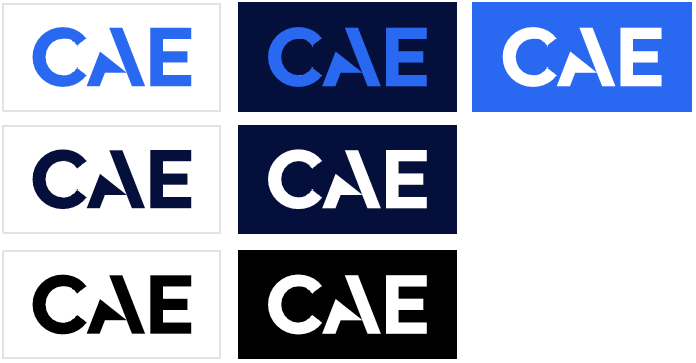
Our logo helps our audiences identify us. We never alter, modify, or recreate it, because doing so would dilute the value of our brand.

Our logo should always be taken from the electronic files provided as .ai, .png and .svg formats, and it should always be used in its entirety.

Any substitution of the symbol or wordmark is not acceptable.

  • Our logo must be easily seen and recognized.
  • Do not crowd it with other images or type. The clear space around the logo should be, at a minimum, the width of the "E" letter form.
  • Never distort or italicize the logotype.
  • Never reproduce the logotype with a special tint, gradation or texture.
  • Never substitute any of the type elements of the signature with another font.
  • Never place the logotype on a complex texture background.
  • New use second generation copies or laser printouts as reproduction materials.
Our full colour logo
Clear space
Colour Variations

When using the logo

  • When on a white background, the logo can be used in Dark Blue or Bright Blue.
  • When on a Dark Blue background, the logo can be used in Bright Blue or White.
  • When on a Bright Blue background, the logo should only be used in white (Not Dark Blue).
  • Black logo on white should only be used when necessary.
Our Illustrations
Our illustrations are inspired by our technology stylized renditions of simulators, blueprints and dashboards create a dynamic style. We use illustrations when we need to speak to an abstract concept that one photo can’t capture or when an appropriate image can’t be found.

Characteristics

  • Our illustrations are always linear, never filled in.
  • Our illustrations should evoke a sense of dimensionality and are often drawn in 3D.
  • Our illustrations should be used most often in Bright Blue on Dark Blue.
  • They can also be used in Bright Blue on White or White on Bright Blue, but only when necessary.
  • Do not use any colours or colour combinations other than those illustrated at right.
Abstract Graphics

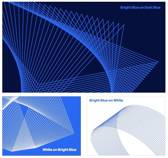
Similar to our illustrations, our abstract graphics are used to conceptualize abstract ideas. Our abstract graphics should be used when a concept isn't depictable or when an abstract graphic is more appropriate for the communication.

Characteristics

  • Our graphics are always linear, never filled in.
  • Our illustrations may be used in Bright Blue on Dark Blue, Bright Blue on White, or White on Bright Blue.
  • Never use Bright Green for either the graphic or the background.
  • Do not use any colours or colour combinations other than those illustrated at right.
Download Graphics
Iconography

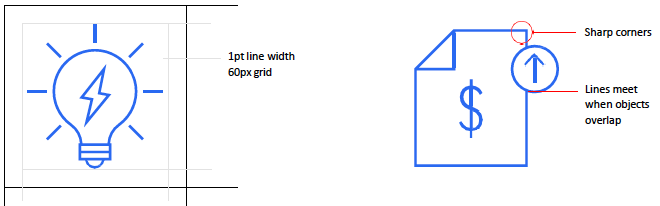
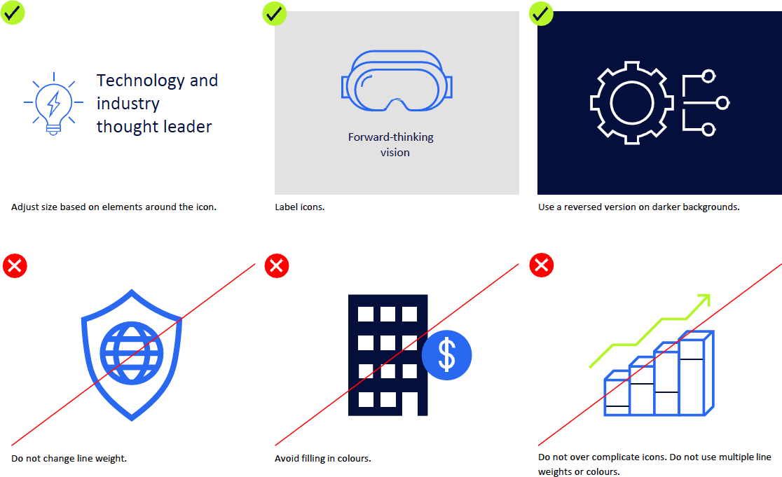
We use iconography as a visual shorthand to represent simple objects or actions. Our icon style is linear and straightforward, with simple geometric shapes

Characteristics

  • Use geometric shapes.
  • The elements should be contained in the middle, within a 60px square, unless there are more than two objects in an icon (e.g., top left icon below, with gear and nodes).
  • When two objects overlap, there should be no space between the two. The lines from each object should intersect.
  • Corners are never rounded, they always form a right angle.
  • The default colour for icons is Bright Blue. You may change to one of the colours from our colour palette, if necessary.
  • When a letter or symbol (e.g., "?", "i") as an icon, use Red Hat Display typeface.
  • When outlining, place the line in the center.
  • To create a new icon, contact our branding team.
Download Icons
Our Colours
Colour plays a critical role in the way that we express our brand. Our simple yet bold colour palette has been carefully chosen to ensure that the CAE brand feels both human and high tech. The pie chart at right represents the percentage that a given colour should be used. Our palette is made of two types of colours: primary and secondary.

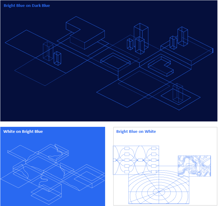
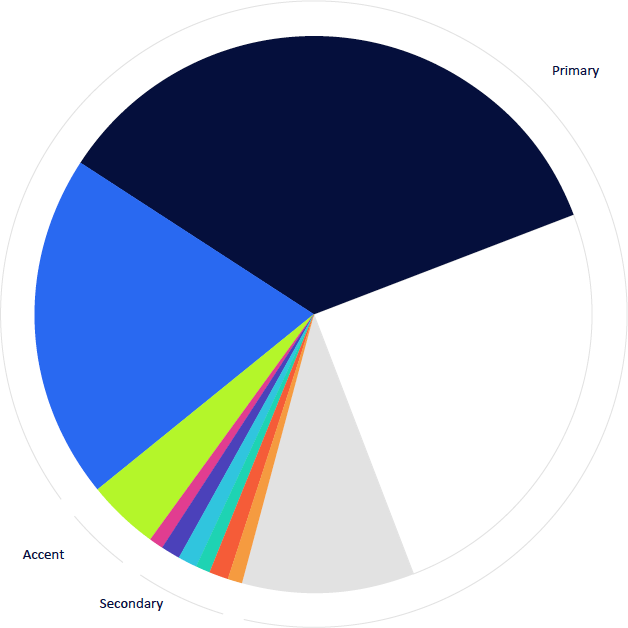
Use Dark Blue, White and Bright Blue as our primary colour floods. Use Bright Green only for text and linear graphics and for buttons in digital, as it displays better in digital than in print; therefore, limit its usage in printed materials.

Secondary colours should be reserved for use in infographics, charts and graphs. Do not use secondary colours for everyday branded materials.

Colour Specifications
Primary colours
Dark Blue

Pantone 2767
CMYK: 100/71/0/66
RGB: 6/16/61
HEX: #06103D
Opacity: 100%
Bright Blue

Pantone 2387
CMYK: 90/60/0/0
RGB: 41/105/242
HEX: #2969F2
Opacity: 100%
White

CMYK: 0/0/0/0
RGB: 255/255/255
HEX: #FFFFFF
Opacity: 100%
Accent Colours
Bright Green

Pantone 2290
CMYK: 40/0/64/0
RGB: 180/246/42
HEX: #B4F62A
Opacity: 100%
Neutral colours
Grey

CMYK: 10/7/7/0
RGB: 227/227/227
HEX: #E3E3E3
Opacity: 100%
Pale Grey

CMYK: 2/1/1/0
RGB: 248/248/248
HEX: #F8F8F8
Opacity: 100%
Black

CMYK: 0/0/0/100
RGB: 0/0/0
HEX: #000000
Opacity: 100%
Our Typography
Our typography enables a distinctive and recognizable visual voice for CAE. Our primary typeface is Red Hat Display With its precise, engineered letterforms, it positions CAE as a high tech and modern company. Red Hat Display is clean, confident and highly legible and works flexibly across our communications needs.
Red Hat Display
Light

AaBbCcDdEeFfGgHhIiJkK
LlMmNnOoPpQqRrSsTtUu
VvWwXxYyZz
01234567890!@#$%^
Regular

AaBbCcDdEeFfGgHhIiJkK
LlMmNnOoPpQqRrSsTtUu
VvWwXxYyZz
01234567890!@#$%^
Bold

AaBbCcDdEeFfGgHhIiJkK
LlMmNnOoPpQqRrSsTtUu
VvWwXxYyZz
01234567890!@#$%^
Download Red Hat Display
Type usage

Using typefaces strategically is the key to creating cohesive and clear communications. Follow these guidelines to ensure a clear information hierarchy.

Headline copy should be used in Dark Blue, Bright Blue or white. All body copy should be used only in Black or White except for calls to action text, which can also be used in Bright Blue or Bright Green.

Primary typeface

Our primary typeface is Red Hat Display. We use this across print and digital applications. Red Hat Display Light is used for headlines. Red Hat Display Bold is used for subheadlines. Red Hat Display Regular is used for body copy.

Use Red Hat Display
Light for headline copy
Use Red Hat Display Regular for subheadlines below headlines.
Use Red Hat Display Bold for subheadlines above body copy.
Use Red Hat Display Regular for body copy.
System typeface

We use Arial Regular and Arial Bold instead of Red Hat Display when creating day to day business communications in desktop programs such as PowerPoint.

Use Arial Regular for headline copy
Use Arial Bold for subheadlines above body copy.
Use Arial Regular for body copy.